Information design surrounds and helps us with our everyday lives. Information would be too complex for people to understand if it was not designed in a suitable structural form. The complex information is made simpler which is dependent on the choice of colour's, type, various weights etc. Colette taught and advised us to learn the following theory when designing for information. To help simplify and organise the information, we need to consider the word LATCH, location, alphabet, time, category or type and hierarchy.
As a graphic designer we should be aware of our surroundings and how design has contributed to make our lives easier. Doing this will help build a stronger understanding into what has already been done and what new needs to be created.
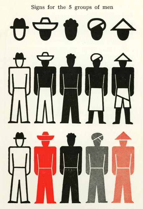
Colette quoted many information designers that inspired her. Otto Neurath, information designer, simplifies complex information through design. He's extremely knowledgeable on how information needs to be put in an understandable form. Neurath developed the 'iso system'. An isotype is a method of showing social, technological, biological and historical information in a pictorial form. He considers the use of shape, line and colour to create simple design similar to the LATCH system as discussed earlier.
Here is a piece of work showing the design considerations used to put information into a pictorial form. He uses a variety of shapes to create hats that represent types of men from different cultures. He also considers colour and line to help distinguish each culture.

Collette advised us to think about designing for information when creating our blogs. Our blogs need to be clear and understandable in terms of design as well as content. Therefore the hierarchy, use of colour, simplicity of layout and position and choice of images need to be considered and suitable. It may be a useful idea to consider the word LATCH as previously discussed.
No comments:
Post a Comment